Responsive Viewer – Test Website Responsiveness
One thing that you must take care of when creating a website is that the website is responsive. This means that the website must adapt to the width of the screen on which it is displayed. If we take the front page of the YouTube website as an example, on larger screens, several clips will be displayed in one row, while on a mobile phone, only one clip will be displayed in one row, because there is no room for more.
Responsive Viewer is a free plugin for Google Chrome that will help you see how a website created in one resolution will look in other screen sizes.
How Does Responsive Viewer Work?
When you install Responsive Viewer, its icon will appear in the upper right corner of the screen, in the part of the Internet browser where the plugin icons are located. The plugin serves as a tool where you can choose which resolutions, i.e. screen widths, you are interested in and compare how your design looks on a large number of different devices.
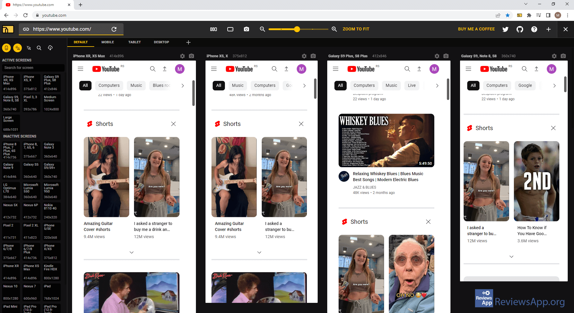
To get started, open the website you are interested in and click on the plugin icon. After this, in a new tab, the main menu of the plugin will be launched. In this menu, you will be able to see how the website will look in different resolutions.
The devices offered are sorted into groups: mobile phones, tablets, and desktop machines, and then arranged so that you can see all the model names, as well as the exact screen resolutions of those models. On the left side are the tools through which you activate Sync Scrolling and Sync Clicks so that scrolling and clicking on any of the displayed resolutions applies to each of them. We liked that in the Export/Import section, you can save all the resolutions, that is, the devices you have tested, in JSON format, which can help you in the further development of the website.
It is important to emphasize that the Responsive Viewer is used exclusively for testing how the website looks in different resolutions. This means that this plugin won’t help you make your website responsive.
Responsive Viewer Will Help All Designers and Frontend Developers
Responsive Viewer is an excellent plugin, and the function it performs will greatly help all designers and frontend developers. It is extremely easy to use, and the functions it contains are much better than those we have in the Internet browser. During use, we did not encounter any problems or bugs, so Responsive Viewer gets our recommendation.
Platform:
Google Chrome

Rate:
 (No Ratings Yet)
 Loading...


